
The Panda Dial: How Professional Necessity Became Watchmaking’s Most Iconic Aesthetic
AI-assisted voice playback. Starts only when you choose Play.
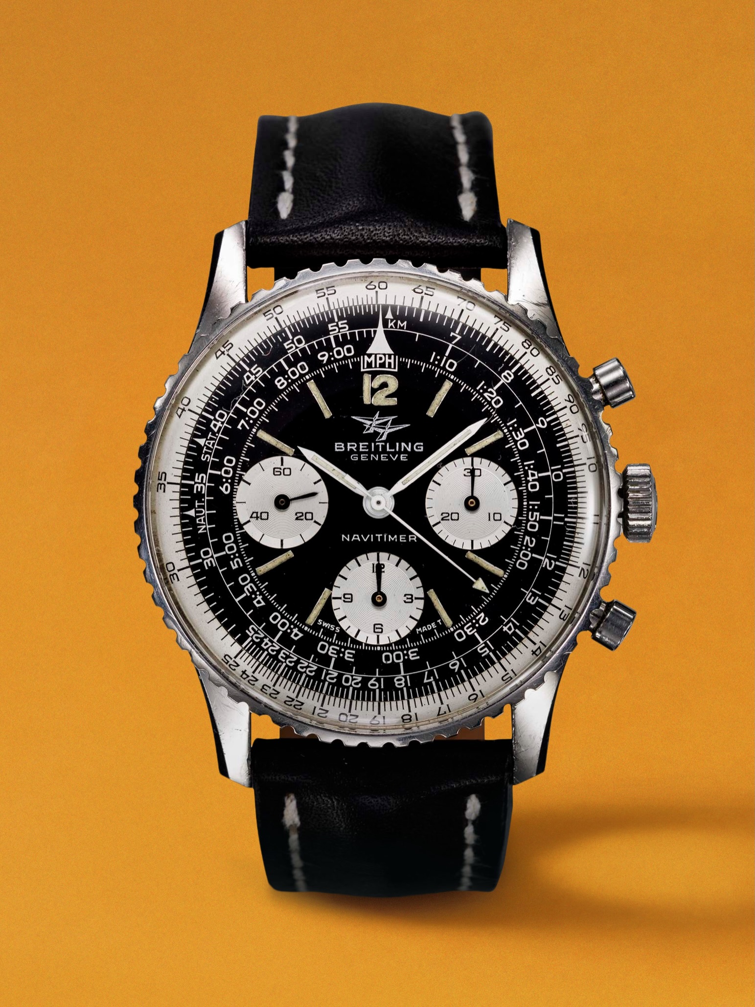
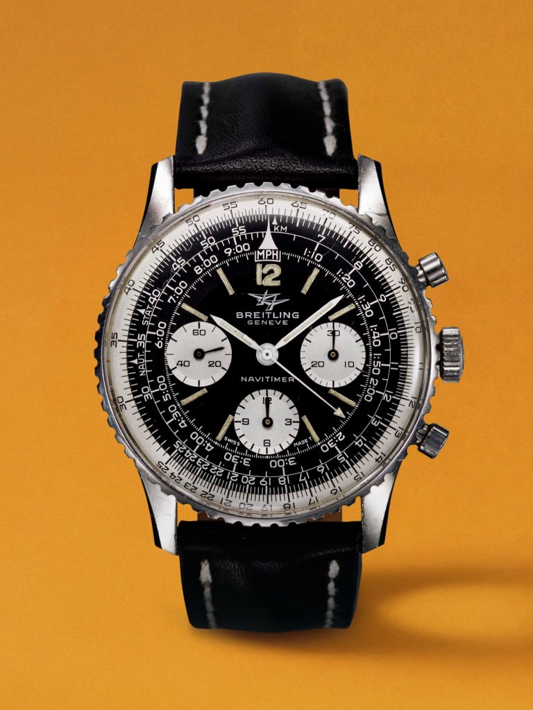
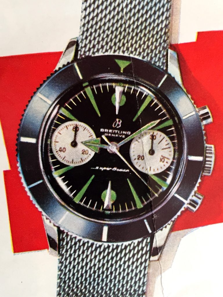
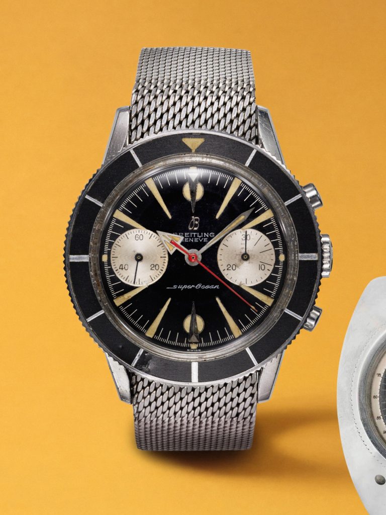
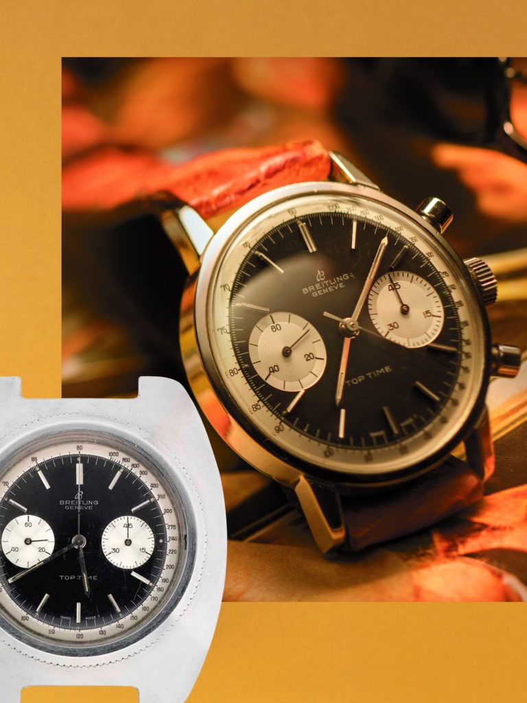
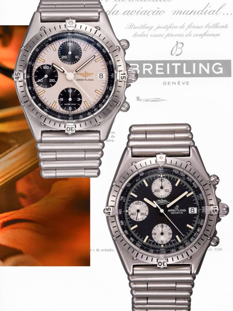
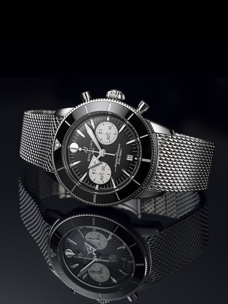
The panda dial occupies a peculiar place in luxury watchmaking: a design so visually distinctive that it has become shorthand for a certain kind of serious, purposeful chronograph. Yet its origins owe nothing to aesthetic intent. When Breitling introduced the SuperOcean reference 807 in 1957, the reverse-panda configuration—dark subdials against a light background—was engineering first, style second.
The distinction matters. In an era when many horological innovations have been retrofitted with romantic narratives, the panda dial's provenance remains grounded in function. It was born from the specific demands of professional diving, an environment where split-second readability determined not merely convenience but safety.
The Underwater Imperative
The SuperOcean 807 arrived at a moment when diving was transitioning from the realm of military specialists to a more structured commercial practice. Saturation diving, deep-water construction and underwater salvage operations demanded instruments of unprecedented reliability. The dial design reflected this reality: the contrast between dark subdials and a luminous main field maximised visibility in the challenging optical conditions beneath the surface, where light diminishes rapidly and ambient darkness creates reading difficulties that land-based timekeeping never encounters.
The reverse-panda layout—inverting the traditional chronograph logic where the main dial is darker—was a pragmatic solution to a genuine problem. Divers needed instantaneous, unambiguous time readings in conditions where hesitation could prove costly. The high contrast achieved by dark counters set against a bright background provided that instantaneous clarity.
From Tool to Signature
What distinguishes the panda dial's evolution is that its transition from professional necessity to aesthetic marker did not diminish its original purpose. The design retained its functional integrity whilst simultaneously acquiring something else: cultural weight. As diving evolved and became more accessible, and as professional chronographs increasingly found their way onto the wrists of collectors with no intention of descending beneath the waves, the panda dial's visual language began to speak differently.
The specific geometry—those discrete, readable subdials creating visual hierarchy—proved aesthetically compelling in ways that extended far beyond its underwater utility. The design communicated seriousness, precision and a certain restraint. It suggested that form and function, rather than existing in tension, could be one and the same. This alignment resonates particularly strongly in luxury watchmaking, where provenance and honest purpose carry considerable weight.
A Durable Legacy
Breitling's 'Since 1884' editorial series reflects the brand's broader commitment to documenting its own material history. By examining how the panda dial emerged and subsequently evolved, the narrative establishes something important: that iconic design need not be born from artistic ambition. Sometimes it emerges quietly, solving a problem, and proves sufficiently elegant that it transcends its original context.
The reverse-panda configuration has since become one of horology's most immediately recognisable visual signatures, referenced and reinterpreted across the industry. Yet its durability as a design owes substantially to the fact that it was not designed for durability at all. It was designed for visibility at 300 metres. Everything else followed.
The panda dial's seven-decade journey from professional tool to luxury emblem offers a quiet lesson in horological design: sometimes a watch becomes iconic not because it was engineered to be beautiful, but because it was engineered to work. In that honesty lies its enduring appeal.
Imagery is used for editorial purposes. All rights remain with the respective owners, photographers and licensors.

Imagery courtesy of BREITLING (@breitling).